Alex Michakis

Hold the Milk Logo

Hold the Milk

Industry: Plant-Based Beverages and Food
Services: Branding, Packaging.

Brand Adjectives: Luxurious, Down to Earth, Organic, Modern, Soft.

About the Brand

Hold the Milk is a plant-based beverage and food company specializing in oat-based products made from organic oats. Their offerings include creamy oat milk, refreshing oat-based cold brew coffee, and indulgent oat-based ice cream, all crafted to deliver delicious, sustainable alternatives to traditional dairy. With a commitment to quality and eco-conscious practices, Hold the Milk provides tasty, plant-powered options for those seeking to enjoy their favourite treats without compromise.

About the Project

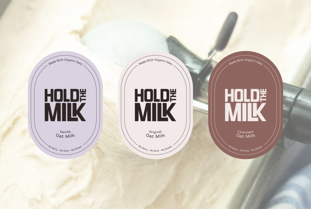
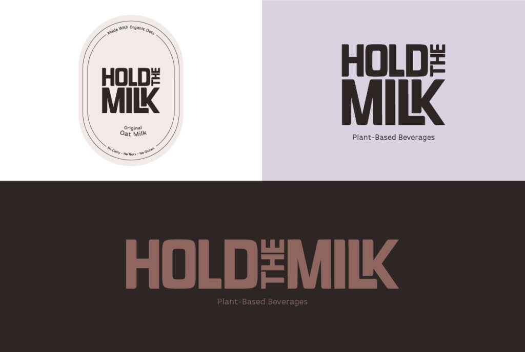
For Hold the Milk, I designed the brand’s packaging and logo to embody a blend of luxury and approachability, reflecting its premium, organic nature. The design features soft, modern elements that convey a sense of warmth and earthiness, with clean lines and elegant typography to highlight the brand’s commitment to quality. The packaging uses a bold, but muted colour palette to create a sophisticated yet down-to-earth aesthetic, making the brand stand out on the shelves while resonating with eco-conscious consumers.

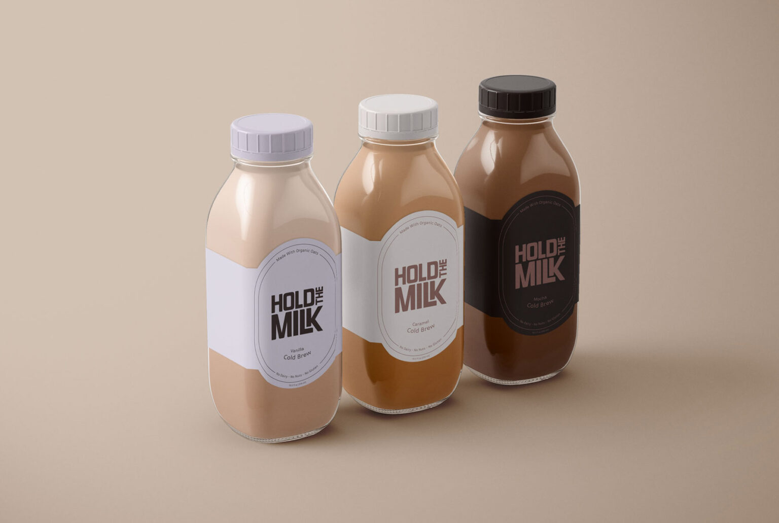
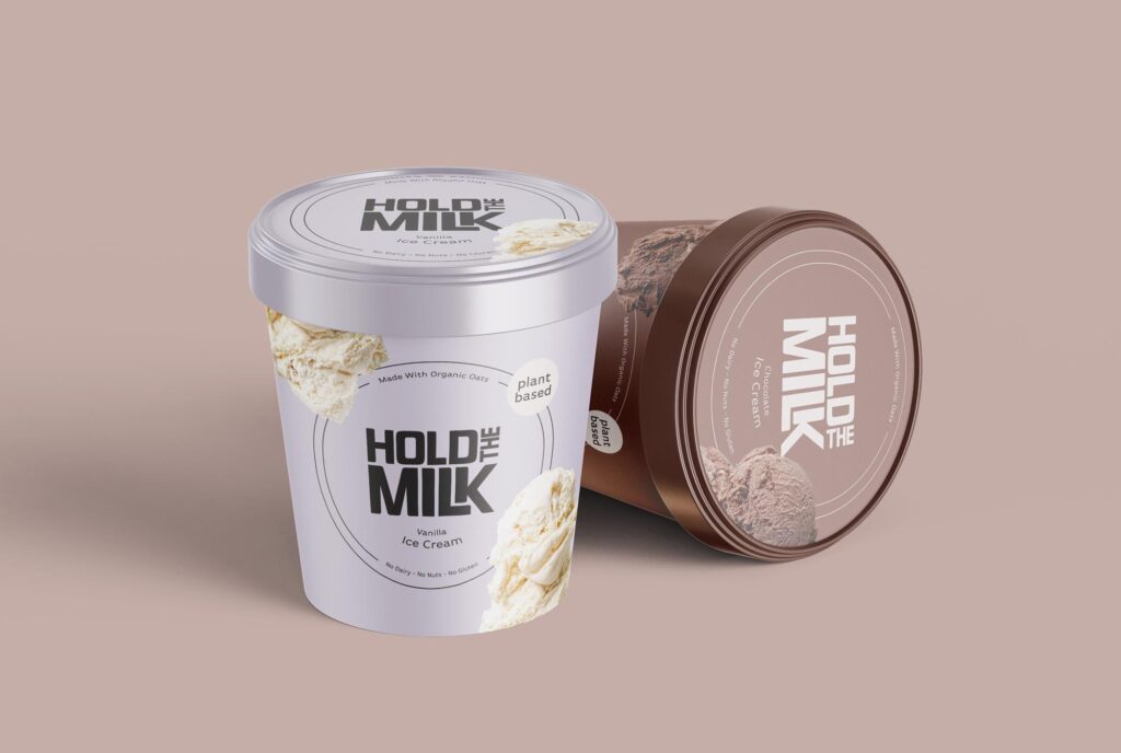
I designed the cold brew bottles to look like vintage milk bottles to have a nostalgic and approachable look. The ice cream pints are clean and minimal, with pictures of the ice cream inside, to entice consumers.

Not a real client, it is a fictitious brand I created*

Hold the Milk Oat-based Cold Brew Coffee packaging
Hold the Milk Oat Milk labels. Ice cream background.
Hold the Milk oat-based ice cream packaging mock-up
Scroll to Top